


“Ok, Google…show me your new logo.”
Google today unveiled a brand new logo for the brave new multi-screen inter-web and it’s amazingly refreshing
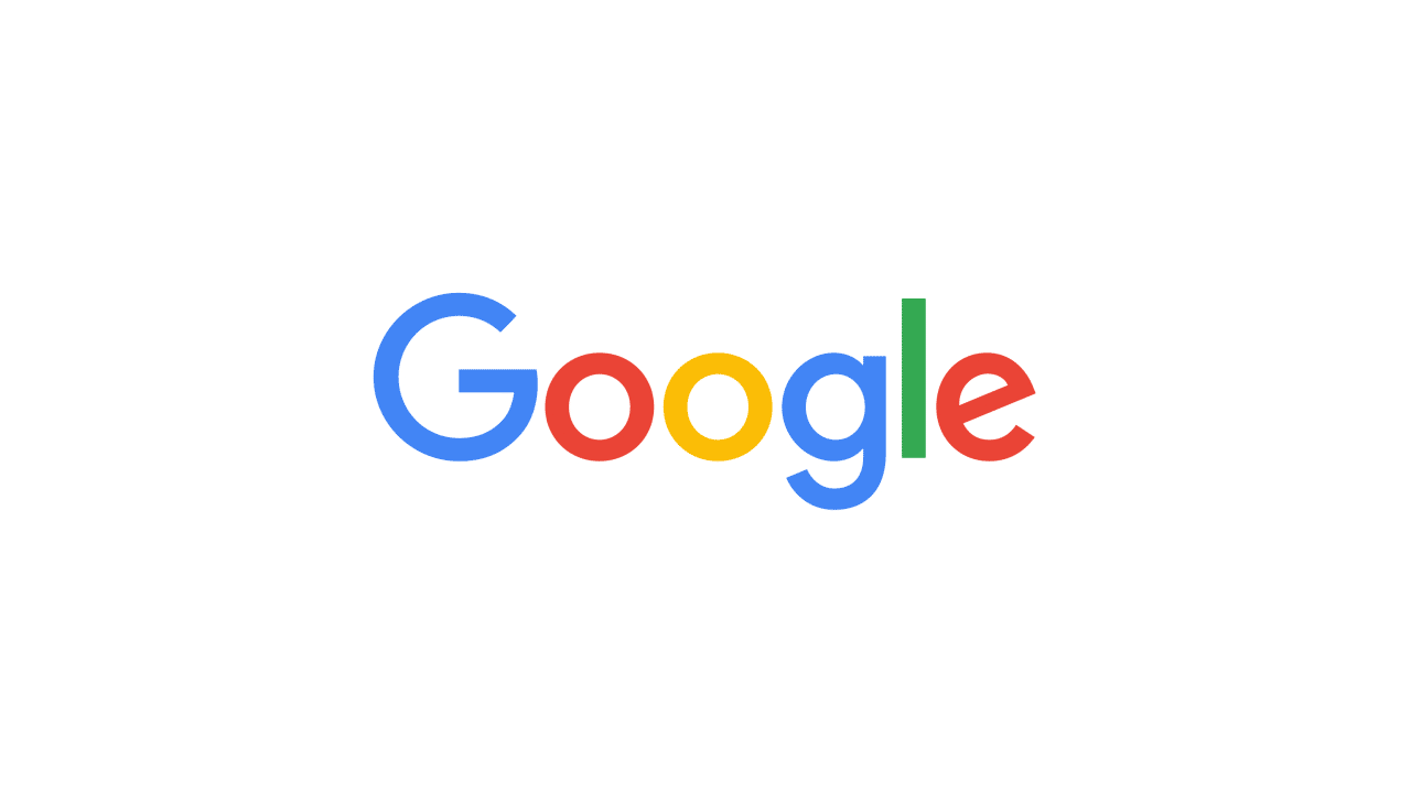
They’ve bid adieu to the little blue “g” icon and replaced it with a four-color “G” that matches the logo. The official statement reads, As you’ll see, we’ve taken the Google logo and branding, which were originally built for a single desktop browser page, and updated them for a world of seamless computing across an endless number of devices and different kinds of inputs (such as tap, type and talk).”
Here’s the logo evolution from 1998 to 2015
![]()
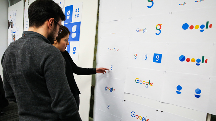
Here are some of the other design options that didn’t make it
Here’s the Google, evolved video
“We think we’ve taken the best of Google (simple, uncluttered, colorful, friendly), and recast it not just for the Google of today, but for the Google of the future. You’ll see the new design roll out across our products soon.
Hope you enjoy it!”