
We have all played the game ‘Guess the logo’ on our smartphones at some point or the other. And you didn’t have to be a marketing nerd to play it. Sure, there were levels that forced some of us to take help from Google (including me) but the idea to get it all was too fancy to quit!
While I don’t doubt your logo vocabulary, there still exists a bunch that will widen your eyes. Yes, you have seen them around innumerable times but the subliminal messages or signs hidden within will certainly leave you wanting for more.
1. Toyota
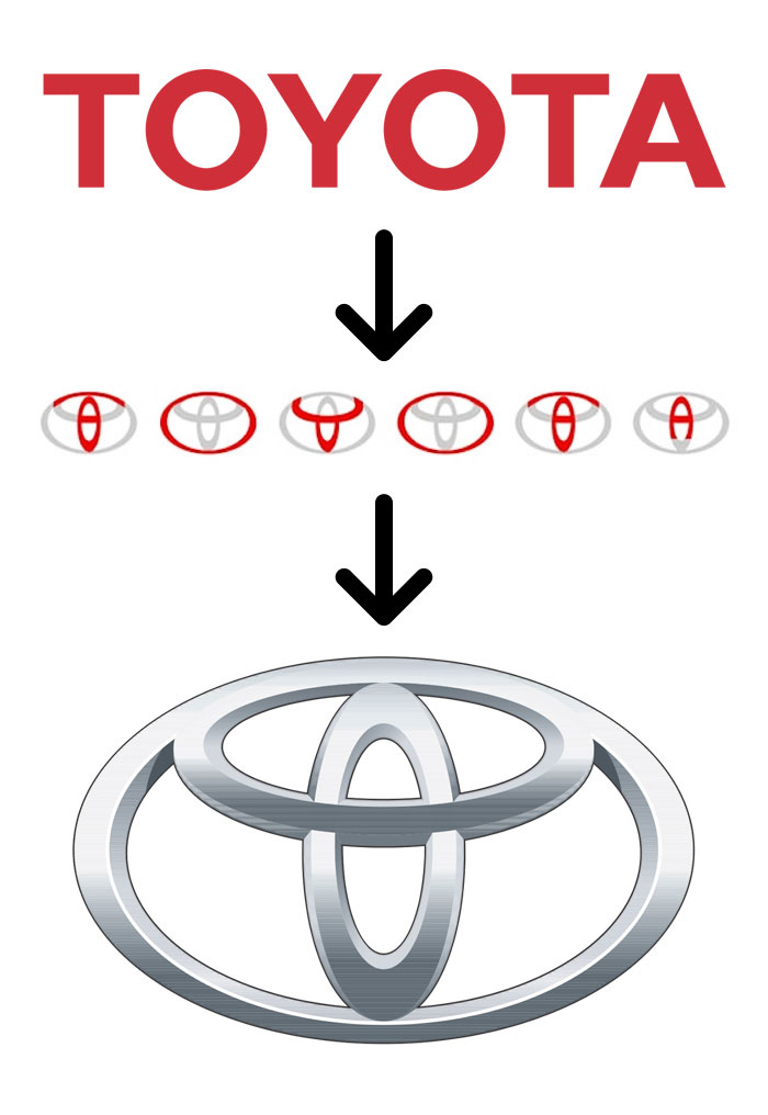

The logo is a really smart work of typography that accommodates every letter present in the name of the company.
2. Toblerone


The highlights show the city Bern (where Toblerone is made). The logo also has a bear silhouette because the place is also known as the city of bears.
3. Tour De France
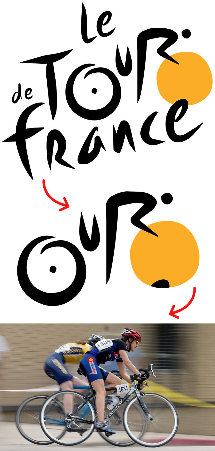

The breakdown of the logo is ample to signify that the text represents a biker (probably roaming around France).
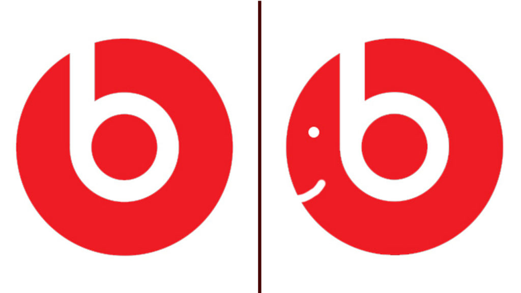
4. Beats
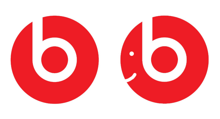

The logo of the company actually hints at a person who is wearing beats headphones. You, me, it can be anyone!
5. Fedex
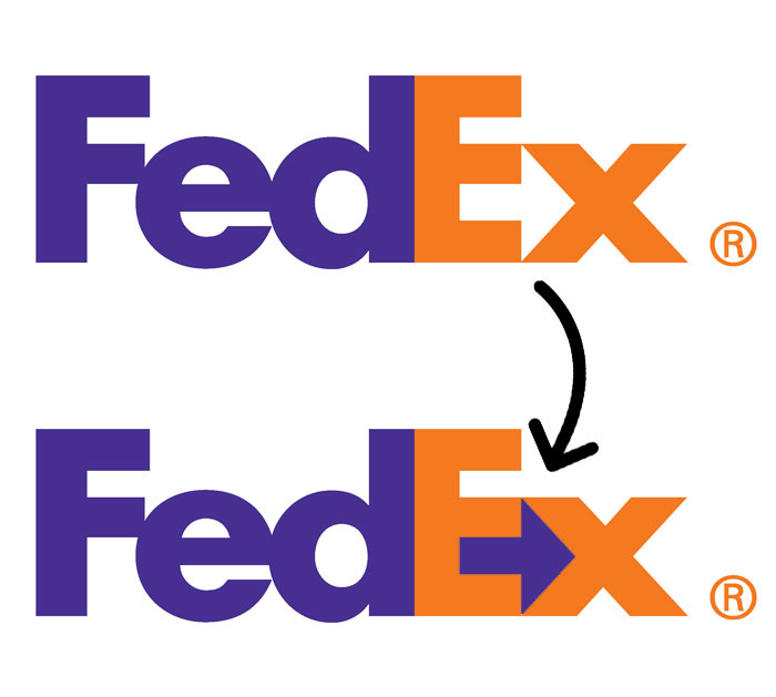

The company has used an arrow in between text. It denotes that the company is always on the go, striving to get things done. Awww, Fedex!
6. Pinterest
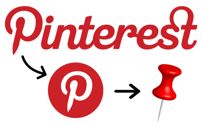

Needless to say, the logo is a pin and it is symbolic because of the word ‘pin’ in the company’s name.
7. Amazon
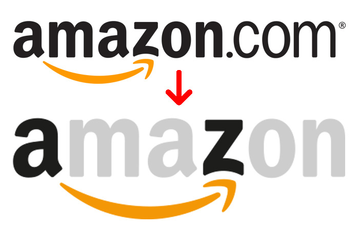

Apart from the obvious ‘a’ to ‘z’ statement, the logo also has a smile patched to it.
8. Hyundai
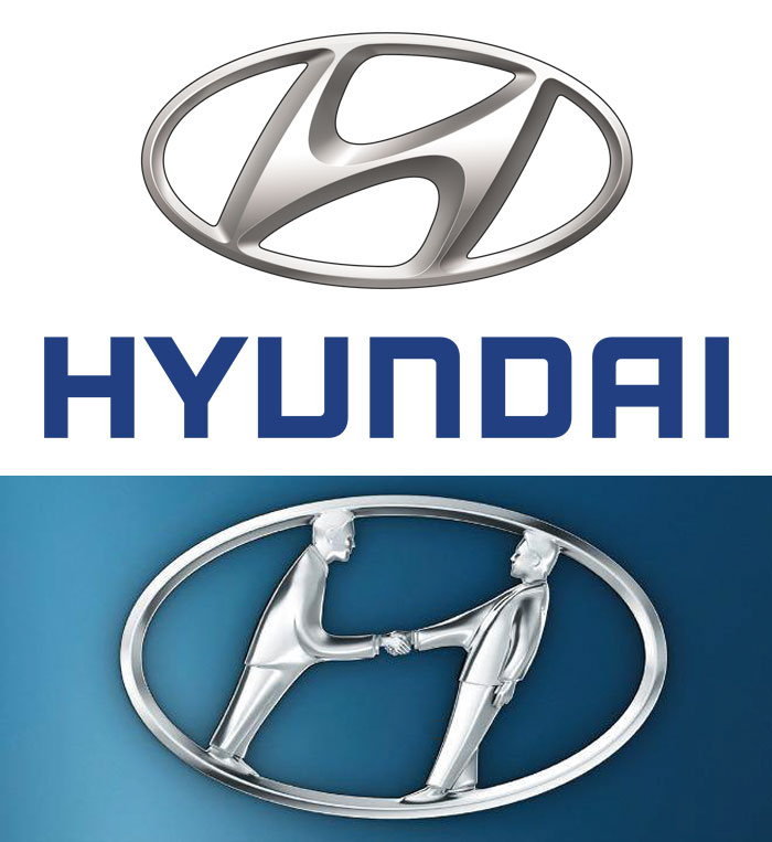

The logo is the initial of the company’s name. But it also strikes as a handshake between a car dealer and a probable customer.
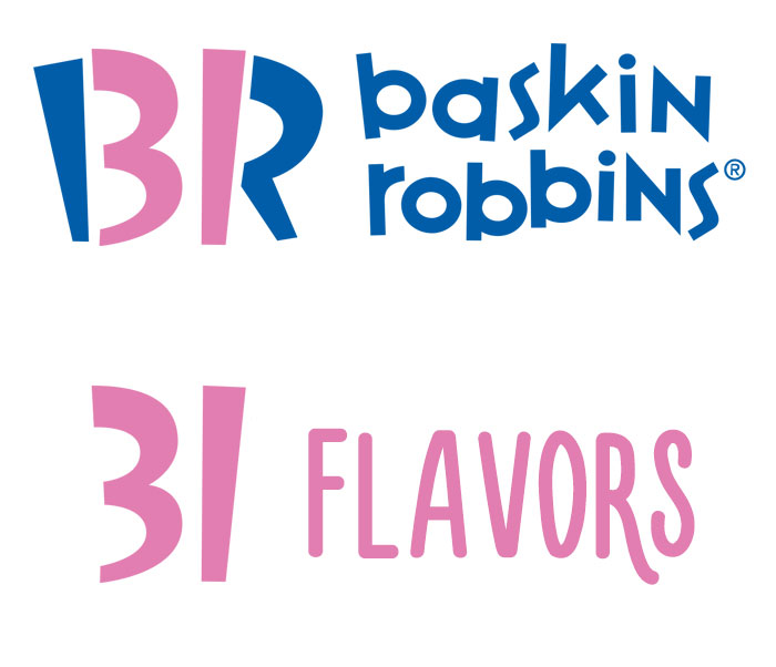
9. Baskin Robins

10. Levis Jeans
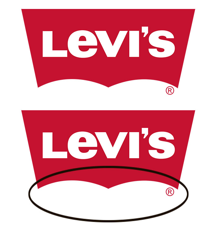

If you already haven’t figured out, the cutout at the bottom of the logo is in the shape of well, butts!
11. London Symphony Orchestra
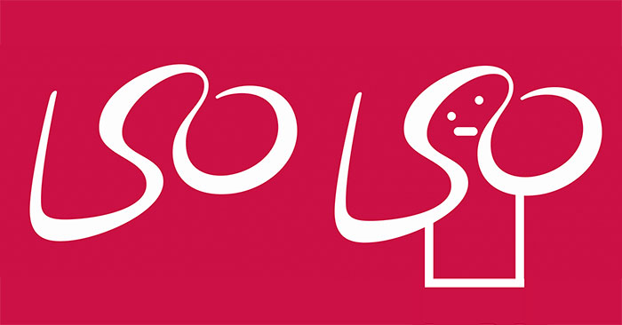

The letters on the logo appears to be a conductor orchestrating at an orchestra. Befitting, isn’t it?
12. Northwest Airlines
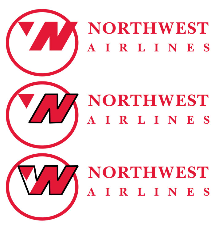
The letters ‘N’ and ‘W’ have been entwined to look like one. Now that’s something!
13. Alfa Romeo
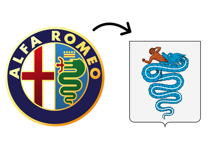

The left side of the logo of the Italian car manufacturer has a red cross on white which represents a symbol of Milan, the hometown of Alfa Romeo. And the right side of the logo is a symbol, representing a mythological animal with a human in his mouth (some believe it to be a dragon, but most likely a snake). Woaaah, interesting!
14. Unilever
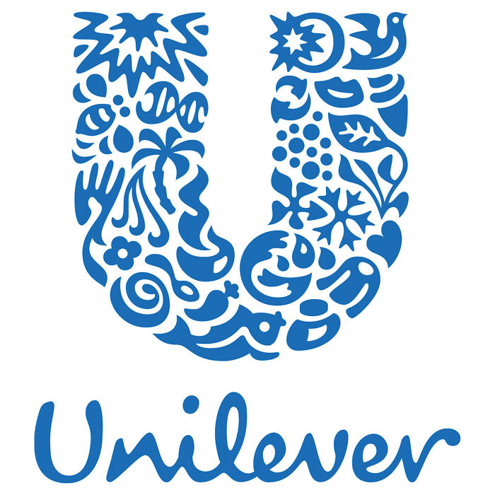

The logo is an all-encompassing one. It has different icons put together to make a sustainable living. We can surely take a cue!
15. Galeries Lafayette.
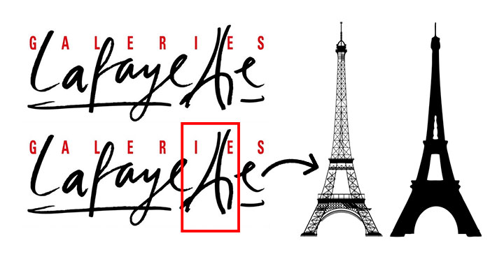

Isn’t it smart how both the ‘t’s in the text play up to form the Eifel Tower. That there is almost as important as Paris!
Blown away, aren’t you? You’re welcome. And if you knew it already, why won’t you share this with other motley fools?!
H/T: BoredPanda