


Pepsi, Thumps Up, and Coca-Cola are some of the cola brands that have a considerable amount of loyal consumers. Now, don’t come at us for saying which one is better than the other because we are here to give you an update about the global beverage brand Pepsi.
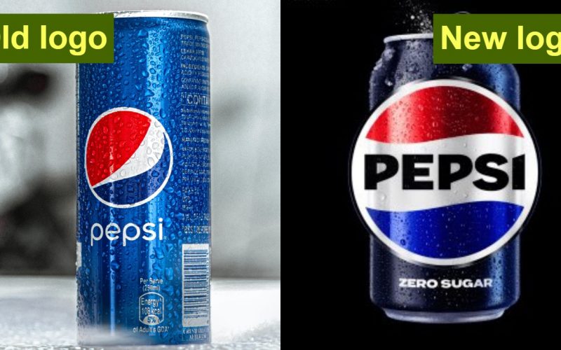
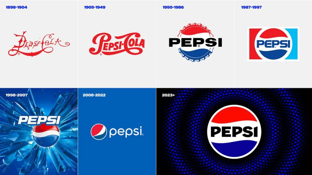
For years we have seen the brand stick to the basic red, white, and blue globe in the center of its bottles as its trademark logo.
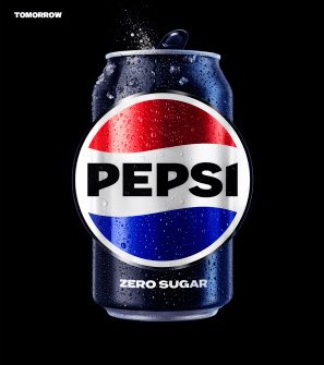
But now, for the first time since 2008, the company has revamped the design of its logo to give it a more modern and polished look. Unlike earlier, the new logo has “Pepsi” written on the white stripe, in bold, in the center of the globe. The placement of the three colours is also very different, reminding us of the flag of the Netherlands.
The old and new logos were tweeted by the Twitter account “Pop Base”.
Pepsi has changed their logo. pic.twitter.com/BXQP4d3t9G
— Pop Base (@PopBase) March 28, 2023
As of now, the brand intends to roll out the new logo in North America this year. However, they’re looking at making it readily available worldwide next year, reported India Today.
People online had a lot of opinions about this bold and contemporary logo of the brand. This is what they said:
Still not coke tho.
— Darren Grimes (@darrengrimes_) March 28, 2023
Same guy designed the Twitter Blue logo. The lack of creativity is staggering! pic.twitter.com/FoTIzZR7Zi
— muto (@mutohd) March 28, 2023
It’s retro and modern. They made the right call. The previous logo was a departure that forgot about what made Pepsi cool.
— art tavana (@arttavana) March 28, 2023
Pepsi with a Pep up that everyone can see.
— Chuma Nnoli (@ChumaNnoli) March 28, 2023
Not sure how I feel about the Font.
— AdVenture Capitalist (@AdVenture_CapHH) March 28, 2023
Coke would never and that’s why we drink it
— D E V V Y (@spaceydevvy) March 28, 2023
I liked the old one
— Nathan Richardson (@NathRNath) March 28, 2023
Looks like a toothpaste brand to me
— Serena Koeber (@SerenaKoeber) March 28, 2023
new logo kinda eats yall hate everything 😭
— Mona (@RealMona_) March 28, 2023
For me it’s 1998-2007 pic.twitter.com/W8lVG9SEQB
— Paradigm City (@ParadigmCityy) March 28, 2023
horrible, the old one was much more harmonious
— Yoko Ono Okami (@YokoOnoOkami) March 28, 2023
Downgrade
— Ricky Bradshaw (@rickybradshaww) March 28, 2023
🇱🇺🇳🇱
— nur h2o (@privquenur) March 28, 2023
This is how Pepsi’s logo looked over the years:
Not a lot of people are feeling it. Are you into the new revamped Pepsi logo?