


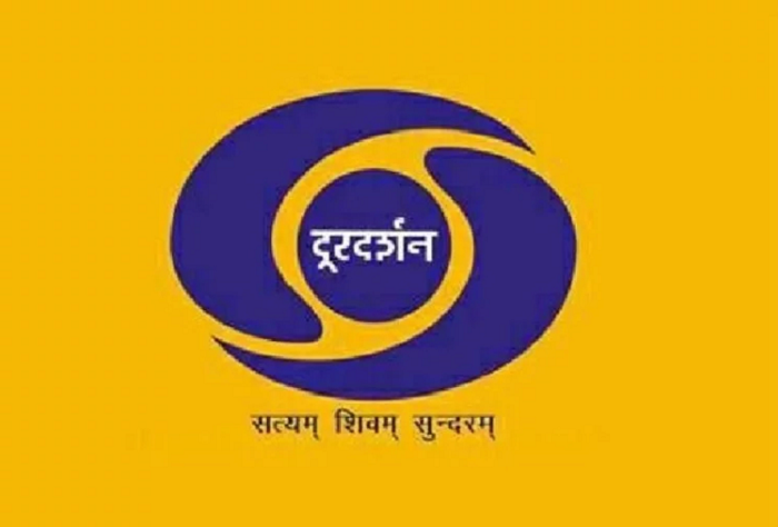
A large part of every 90’s kid’s childhood was sitting in front of the TV, watching shows like Malgudi Days, Shaktiman, Tu Tu Main Main, and Dekh Bhai Dekh on Doordarshan. The channel with its odd music and circular logo will always have a special place in our hearts. Hence, it is a given that when someone wants to tamper with our fondest childhood memories, people will step up in protest!
Sources reveal that back in 2017, Doordarshan had announced a logo designing contest which ultimately received over 10,000 entries. The channel claimed to seek a new design in order to cater to today’s youth.
“The new logo while recalling the strong nostalgia associated with the DD brand, should reflect the aspirations of new India,” the channel officials said in a statement.
The 5 shortlisted Doordarshan logos were posted on Twitter by Prasar Bharati’s official handle.
Doordarshan Logo Contest – Here are the top 5 logo designs selected out of more than 10,000 entries. pic.twitter.com/qV8Ni2Zkj8
— Prasar Bharati (@prasarbharati) May 20, 2019
However, while the shortlisted designers are to receive 1 Lakh INR each, the news didn’t go down well with netizens. Twitter is filled with angry tweets by Doordarshan loyalists who are absolutely disappointed with the new logos, expressing how the original logo is far better.
Best pic.twitter.com/wwfMJxqPya
— காஸ்மிக்பிளின்கர் 🇮🇳 (@cosmicblinker) May 21, 2019
Fire the selection committee . This is worse than clipart!
— Anusha Yadav (@anushayadav) May 21, 2019
primary school mein karwaya tha kya contest?
— Rofl Gandhi 2.0 (@RoflGandhi_) May 21, 2019
After seeing this – the old one looks fabulous. Please let it be 🙏🏼
— Akash Banerjee (@TheDeshBhakt) May 21, 2019
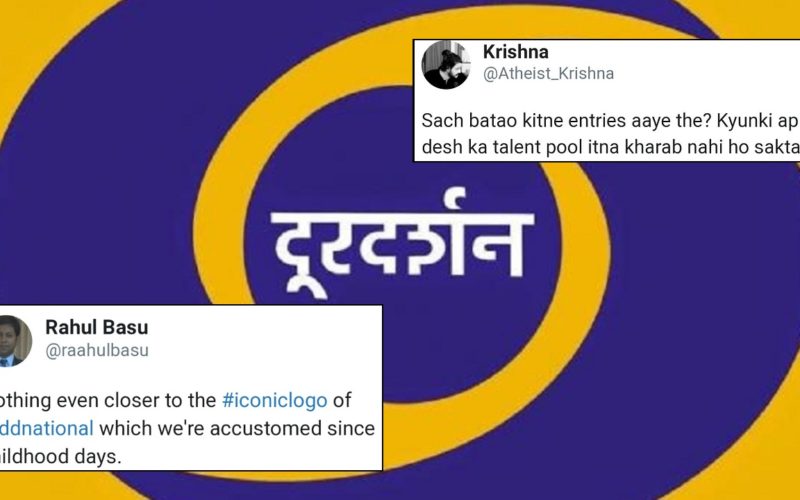
Sach batao kitne entries aaye the? Kyunki apne desh ka talent pool itna kharab nahi ho sakta.
— Krishna (@Atheist_Krishna) May 21, 2019
Look at the 4th logo. With a Kabootar. If this was in the Top 5. Don't know baaki 9995 entries kaisi thi. https://t.co/HL73Rnyf0u
— Gabbbar (@GabbbarSingh) May 21, 2019
These are terrible in their current forms. Logos should never be selected from contests. Hire real designers, pay them, and ask them to build a brand’s entire design language, not just a logo. https://t.co/MV1cHChXsr
— Siddharth Singh (@siddharth3) May 21, 2019
These look really awful.
Out of 10000 entries, if these are the 5 top logo designs selected, then you need to change the team who selected these awful designs and not the logo! #doordarshan— Deepanshu Natani (@DeepanshuNatani) May 21, 2019
Nothing even closer to the #iconiclogo of @ddnational which we're accustomed since childhood days.
Doordarshan's Iconic Logo Will Soon Be History. See Shortlisted Designs https://t.co/kp5xQmBaKP via @ndtv
— Rahul Basu (@raahulbasu) May 21, 2019
Crowdsourcing at it's worst. I cannot believe that these are the top five logos from a population of more than a billion @srishagrawal
Please don't select any of these. I will be more than happy to market your contest free of cost and get quality entries @shashidigital https://t.co/2czQG7gKfz
— Abhishek Rungta🎯 (@abhishekrungta) May 22, 2019
The original Doordarshan logo had been created back in 1976 by Devashis Bhattacharyya, a student of National Institute of Design, which symbolised a human eye.
While we understand change is necessary, this kind of change is uncalled for!