


Logo design and typography has become an essential part of identities in today’s design-centric world. One thing wrong, and people on social media will tear you down. And that is exactly the treatment which was given to Cherry Orchards, a fashion and lifestyle events company based in Kolkata.
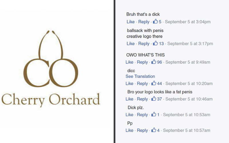
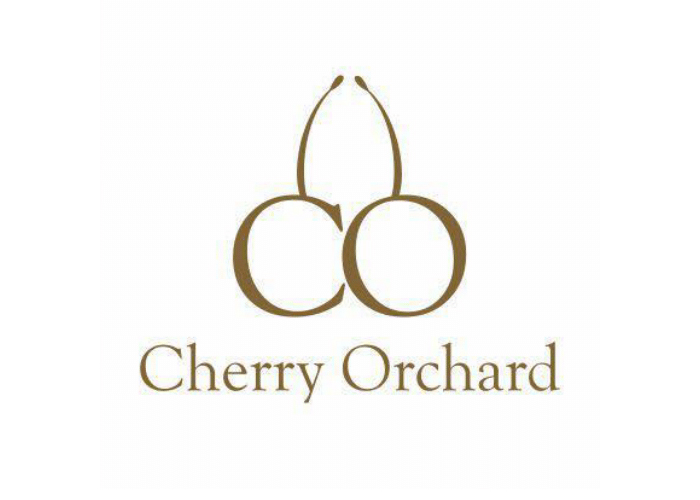
Cherry Orchards put up their logo as their profile picture on their Facebook page, and well, it looks like a penis.
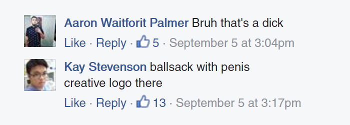
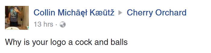
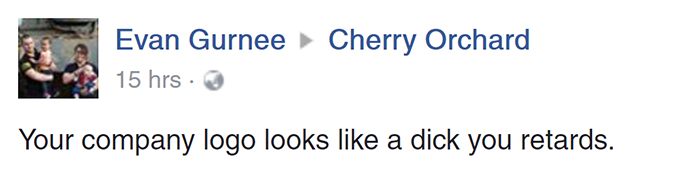
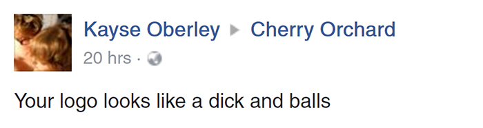
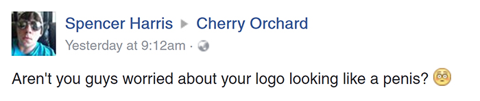
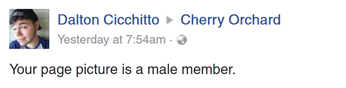
People were quick to notice and they started to comment on the picture. The comments are still pouring in as you read this.
1.
2.

3.
4.
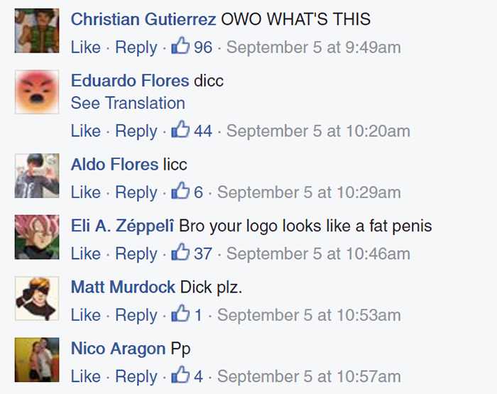
5.

6.
7.

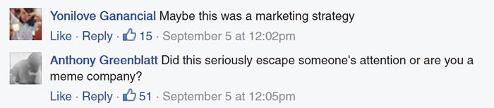
People even posted on the page’s timeline. This seems to be a serious issue, but the company logo has now become a sort of meme.
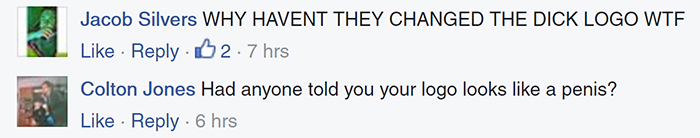
1.
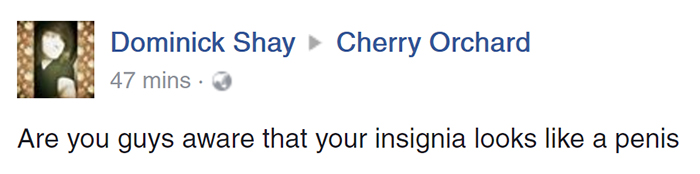
2.
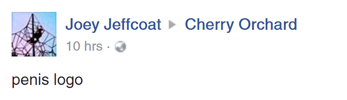
3.
4.
5.

6.
7. cherry orchards has a logo which looks like a dick LOL haha
8.
We’re sure many people might’ve pointed it out to them in person also, but it is yet to be seen if the company makes an announcement or changes their logo.
All images source: Cherry Orchard events (Facebook | Website)